As members of Worldcon75, we are participating in this year’s Hugo Awards voting. Last week, the con released a packet of reading and visual works to help voters access materials on the finalists list. (Note to self: We have until July 15, 2017, 2:59 am EST to get our votes in.)
Apparently this year’s packet is larger than ever before in the 10 years it’s existed. While definitely not the reason for our memberships, it’s an invaluable bonus.
In addition to the official packet, JJ at File 770 did a huge favor for readers and collected a comprehensive list of finalist works published free online.
With all of this reading, I definitely will have no problems with how to fill my days in the foreseeable future!
Thank you, various creatives and rightsholders, thank you, Worldcon75 Hugo Awards staff, and thank you, JJ and Mike Glyer / File770.
It’s an unavoidable fact that when we look at historical artifacts, we’re looking at things that are many years old, sometimes centuries or millennia. Physical objects, even those made of enduring materials like metal or stone, are changed by the processes of time. Exposure to light, moisture, changing temperatures, air pollution, wind, water, and other effects works changes on artifacts that can range from subtle to drastic. Our sense of what history looks like is shaped by things that no longer look like what they were when they were first being made, admired, and used by people in their daily lives.
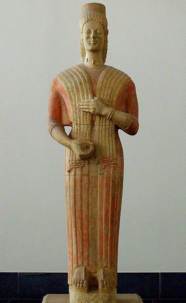
Take, for example, the sculptures and architecture of ancient Greece. Our perception of ancient Greek art is shaped by the white marble statues and temples that remain today, but the originals were not white. We know from ancient descriptions and a few pieces with surviving traces of paint that the stone buildings and sculptures of ancient Greece were brightly colored.
Examples like this statue of a woman, with traces of paint on her dress, suggest what such a statue might have originally looked like.
Statue of a woman (kore), photograph by Nemracc via Wikimedia (Keratea, Greece, currently Pergamon Museum, Berlin; 580-560 BCE; marble)
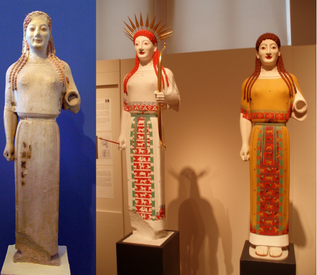
Evidence like this makes it possible to attempt to reconstruct what statues of this type looked like when first created. The two reconstructions on the right here offer two possible interpretations of what the original, on the left, may have looked like when it was new.
Statue of a woman (kore) and two reconstructions, composite of photographs by Marsyas, via Wikimedia (original: Acropolis, Athens; c. 530 BCE; marble; reconstructions: Acropolis Museum, Athens)
The striking colors of the past are not just a phenomenon of ancient Greece. At Stirling Castle, in Scotland, a recent restoration project has brought back the original rich yellow color of the walls of the medieval great hall, which was determined from traces of ochre mixed with the remains of the lime wash applied to the stone. You can see the striking contrast between the restored great hall in the background and the bare stone of the buildings in front.
Stirling Castle, photograph by dun_deagh via Flickr (Stirling, Scotland; c. 1500-1600; stone and lime wash)
Studying history requires an act of imagination. Just as we have to imagine ancient monuments are artifacts new and fresh, not as the worn-out relics we see today, we also have to imagine peoples of the past as vibrant, complicated, living societies, not the stilted, dry facts of textbooks. Fiction has a great value to the student of history, as it helps us imagine ourselves into the lives of people different from ourselves. Our history is always somebody else’s daily life.
History for Writers is a weekly feature which looks at how history can be a fiction writer’s most useful tool. From worldbuilding to dialogue, history helps you write. Check out the introduction to History for Writershere.
Omar Gilani is an illustrator, designer, and concept artist currently based in Pakistan. Not all of his art has sci-fi elements, but the pieces that do are amazing. Take a look:
Omar Gilani
Omar Gilani
The engineer-turned-artist takes inspiration from everyday life and combines traditional drawing with digitally created elements.
Omar Gilani
Omar Gilani
I am very sorry I found out about his work only a day(!) after the Hugo nomination period closed. Well, hopefully he’ll continue producing genre art so I can nominate him next year.
A NASA Tumblr post about the newly found exoplanets in the Trappist-1 system included fantastic artist’s renderings of what the system and the planets might look like.
“The planets also are very close to each other. How close? Well, if a person was standing on one of the planet’s surface, they could gaze up and potentially see geological features or clouds of neighboring worlds, which would sometimes appear larger than the moon in Earth’s sky.”
One is even a retro-style travel poster! (See other NASA retro travel posters here.)
Such an arresting fan illustration by Red Scharlach of a magazine cover for the inimitable Mrs. Hudson from Mark Gatiss’s and Steven Moffat’s Sherlock, played by Una Stubb:
An awesome cover for an awesome character. Kudos!
In Making Stuff occasional feature, we share fun arts and crafts done by us and our fellow geeks and nerds.
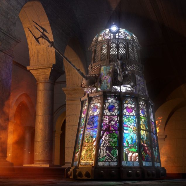
Did you see this amazing stained glass Dalek already?
Producer / director / writer Jamie Anderson worked with designer Chris Thompson to help make the lead and stained glass Dalek a reality. It’s based on a Doctor Who audio drama script by Mike Tucker called Order of the Daleks.
“My main thought process was to create a “Gothic” Dalek and replace all the flat surfaces with glass designs. My initial sketches had palisades, crowns, spikes and other gothic elements, but we decided to dial a lot of these back for story reasons. In the episode itself these Dalek casings are made by very primitive monks so the focus needed to be on the stained glass and not the metal elements.”
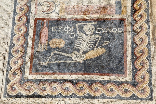
This skeleton lounging with a drinking vessel in its hand, sitting next to bread and an amphora of wine is definitely very apropos:
Known as the skeleton mosaic, the panel is part of a triptych discovered in the dining room of a house in Antakya, Turkey (ancient Antioch). The accompanying words (‘euphro’ + ‘synos’) have been translated as “be cheerful, live your life,” presumably to remind diners of the briefness of life.
The anthology Hidden Youth, with Erik’s story “How I Saved Athens from the Stone Monsters”, is expeced in November. We don’t know exactly when yet, but we know that the file has been sent to the printer. It’s very exciting—almost there!
I rounded up some of the artwork commissioned for the collection, but first here’s my headcanon picture for “Stone Monsters.”
In the beginning of “Stone Monsters,” there’s a scene where Mnestra, one of the protagonists who works as a flute girl, uses her veil to try and attract customers. I don’t think it was Erik’s intention, but the scene immediately brought to my mind this amazing, dynamic Greek statue we’d seen years ago at The Met:
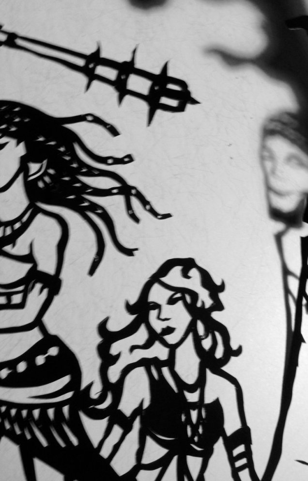
When thinking about “Stone Monsters,” this is the image that I connect with the story. Unfortunately the dancer’s veil is drawn so close that we can’t see her face. That’s where the Hidden Youth artists come to the rescue. I just happened to see this sneak peek by Paula Arwen Owen of her papercut illustration for “Stone Monsters” on Twitter:
That’s eggplant and egg, all right, with a herma in the background. 🙂 Love it!
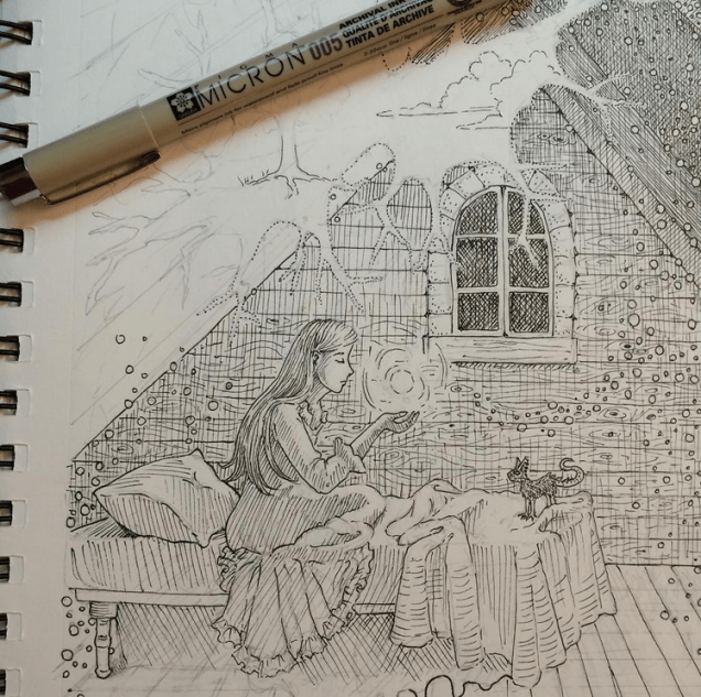
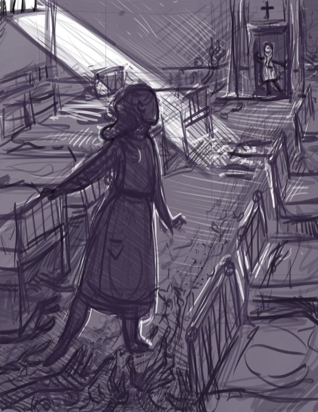
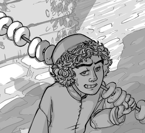
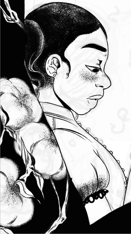
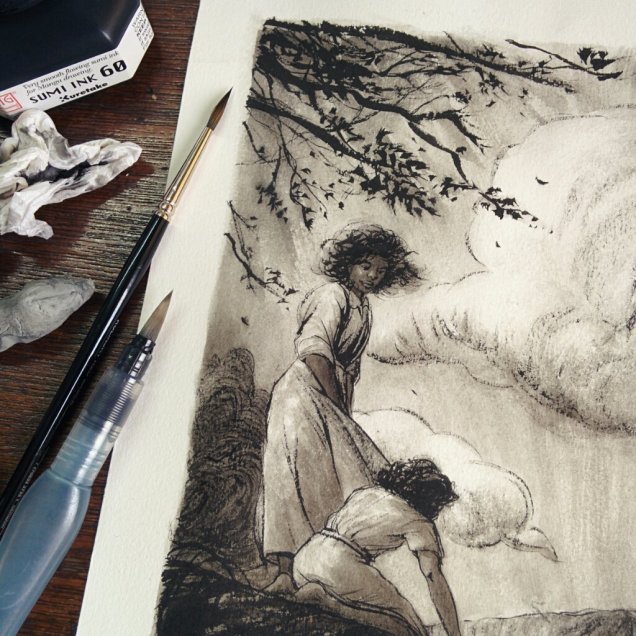
Then I was curious and went looking for Hidden Youth art. Others have also posted glimpses of their work in progress. For example, Ellen Million:
They all look so great—can’t wait to have the book in my hands!
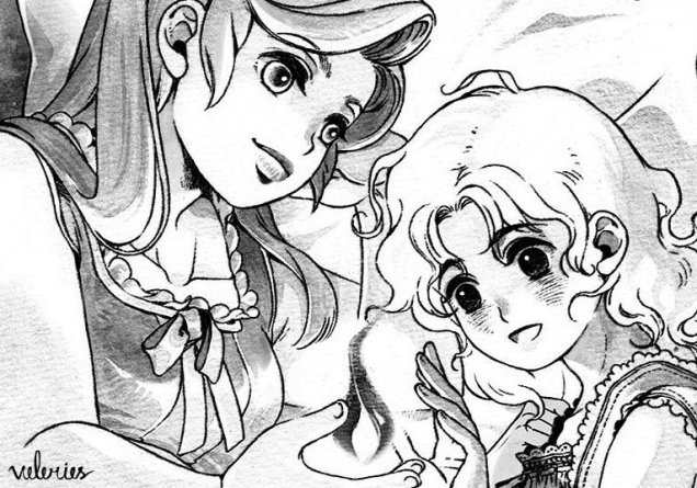
Images: Bronze statuette by Eppu Jensen (Greece; c. 3rd-2nd century BCE; bronze). Papercutting by Paula Arwen Owens via Twitter. Attic room by Ellen Million via Instagram. Two girls by Thio Wina Oktavia via Twitter. Dormitory by Kat Weaver via Twitter. Street seller by A. D’Amico via Twitter. Leaning girl by Jay Bendt via Tumblr. Under clouds by Charis Loke via Twitter.
In Making Stuff occasional feature, we share fun arts and crafts done by us and our fellow geeks and nerds.
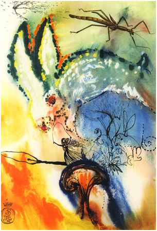
In 2015, commemorating the 150th anniversary of Alice’s Adventures in Wonderland, Princeton University Press reprinted a color edition with illustrations by Salvador Dalí.
Surreal, almost psychedelic, and rarely seen before the reprint, the original gouaches were first published in 1969.
The color use is amazing, and the surrealist style fits elements of the story. However, I can’t escape the feeling that had I seen these illustrations as a kid, they would’ve given me nightmares.
Language can be beautiful. We all know this as readers and writers. But language can also be beautiful as a visual, even physical work of art. In pre-modern societies where literacy rates were low, most people who looked at written text experienced it as a work of art, not as a work of language.
Here, for example, is the beginning of the Gospel of John in the Book of Kells.
Book of Kells, folio 292r via Wikimedia (Ireland; c. 800; ink on vellum)
It may be hard at first to tell that there is even a text in the midst of this work of art, but if you know where to look you can find the Latin text: IN PRINCIPIO ERAT VERBUM (In the beginning was the word).
Book of Kells via Wikimedia, text highlighted by Erik Jensen








_1.JPG)


